Track your usage
Common Powershop terms
Here's a few expressions you'll regularly hear us use, and what they mean.
The Shop
The Shop
Where you go to buy Powerpacks. You can visit the Shop from Powershop’s mobile app or from your desktop account.
Powerpacks
Powerpacks
Dollar amounts of power you can buy from the Shop. Most types of Powerpacks give you a discount on your Standard Rate!
Estimated usage
Estimated usage
We estimate your future usage using consumption data from your meter to calculate and show you:
In the Shop: How many days a Powerpack is likely to last you and how much that Powerpack costs, and
In your Power organiser: How many days or dollars of power you’re likely to be ahead or behind in your Account Review period, taking into account the Powerpacks you’ve bought to date.
Power organiser
Power organiser
A calendar that shows you how long your Powerpacks are likely to last across current and future account review periods based on your Estimated Usage.
Standard power or Standard power rate
Standard power or Standard power rate
The rates you are charged for your power if you don’t buy Powerpacks from the Shop based on your meter-set up, where you live and whether you’re a low or standard user. Our Standard Rates are still competitive, but by buying certain Powerpacks in the Shop, you will reach what we call your Special Rates.
Special rates
Special rates
Your Special Rate is the rate you'll pay if your actual usage matches your Estimated Usage for an Account Review period (a month), provided you have bought the Monthly Staying Power Powerpack and all the Special Powerpacks made available in the Shop during that period.
Account review period
Account review period
This is like a billing cycle. We measure (and if necessary, bill you for) your power usage between the start and end date of your Account Review period. Each Account Review period is a month.
Account review
Account review
A monthly email and attached PDF that summarises your usage, transactions, meter readings and what (if any) balance you have to pay. Learn more
Tracking your usage
How to track your usage
How to track your usage
Use our nifty tools to keep an eye on how much power you’re using, and when you use it most.
Daily usage
If you have a smart meter, your daily usage graph makes it easy to see any changes in your usage. So if your usage spikes or falls dramatically, you can dig a little deeper to try to find out why.
Mobile app: In Powershop’s mobile app – you can access your daily usage graph by tapping the icon at the bottom right of your screen.

Desktop: In your desktop account – go to your ‘Balance’ page and click on ‘Usage’, ‘Average daily use’.

If you have more than one property you’ll see your properties’ daily usage graphs, in a drop-down menu where you can select which property you would like to view.
Read more on how to track usage if you have more than one property.
Current usage
In Powershop’s mobile app – your ‘Daily usage’ graph has a smart feature to show you your average dollar cost per day, and the kWh (kilowatt hours) of power you’ve used each day.

Insights graph
The mobile app also has an Insights graph. The bars in the Insights graph let you see at a glance the monthly dollar cost of your power. Access the Insights graph by tapping the middle icon at the bottom of your screen. This monthly dollar cost for previous Account Review periods shows what you paid for those periods. The monthly dollar cost for your current Account Review period is based on both your actual and Estimated Usage.

Usage pattern
If you have a smart meter, and feel like channeling your inner detective, you can discover what times of day you use the most (and least) power – down to half hourly intervals.
This means you can think about what you normally do at peak times of day and, if possible, make changes to be more energy efficient. You can access this tool from your desktop account. If you don’t have a smart meter you won’t have this tool in your account.
Activity Tracker
Want to get clever about tracking your usage? Then the Activity Tracker on the mobile app is for you.
It’s super simple to use, and we reckon it’ll help you monitor, understand and, ultimately, take control of your usage.
The Activity Tracker allows you to add notes to your ‘Daily usage’ graph, to help you explain any spikes or drops in your power usage. You can also set it to keep track of a future time period.
You can find the Tracker under your Daily Usage graph, by tapping the stopwatch icon in the top left of your screen.
![]()
How to track your usage
How to track your usage
Use our nifty tools to keep an eye on how much power you’re using, and when you use it most.
Current usage
Your daily usage graph shows your average dollar cost per day and the kWh (kilowatt hours) of power you've used each day.
Daily usage
If you have a smart meter, your daily usage graph makes it easy to see any changes in your usage. So if your usage spikes or falls dramatically, you can dig a little deeper to try to find out why.
Mobile app: From the side or bottom nav, select Usage → View trends
Desktop: From the side menu, select Usage → View trends
Monthly usage graph
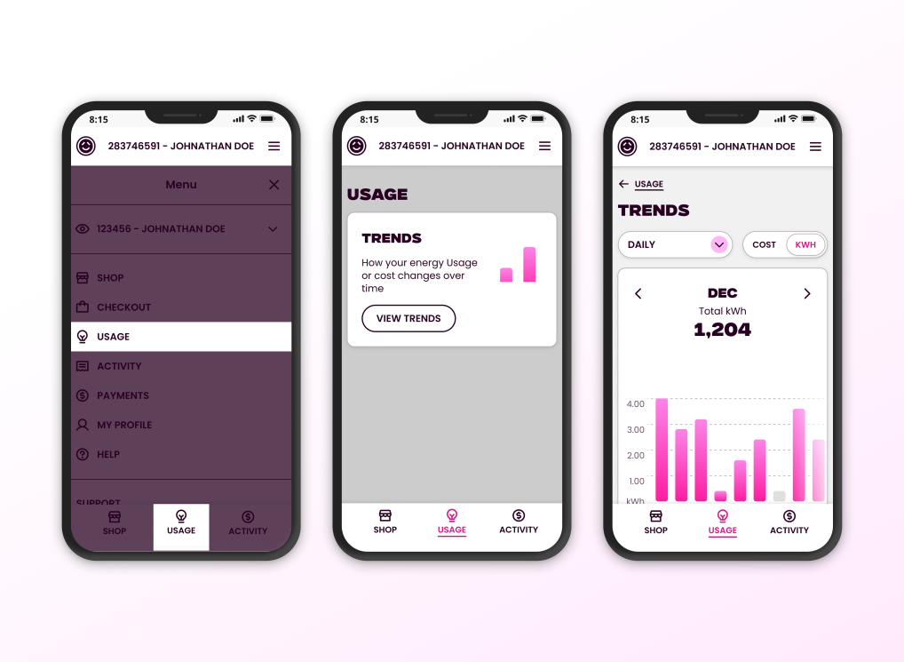
The Insights graph lets you see at a glance the monthly dollar cost of your power. Access it from the Trends page by selecting the Monthly tab.
This monthly dollar cost for previous Account Review periods shows what you paid for those periods. The monthly dollar cost for your current Account Review period is based on both your actual and Estimated Usage.
How do I track my usage if I have more than one property?
How do I track my usage if I have more than one property?
To keep life simple, we’ll combine some of the data for all your properties and keep some of it separate. Whichever makes more sense.
Mobile app
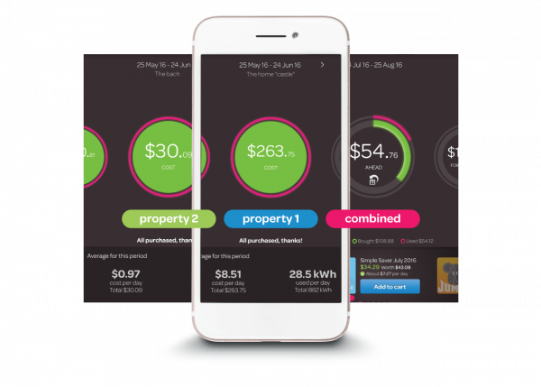
Days and dollars ahead: Inside the circle on the Balance screen we show about how many dollars ahead or behind you are with your power purchases, based on your Estimated Usage. This covers all the properties under your account. If you tap the dollar figure, this will switch to show you how many days ahead or behind you are, based on your Estimated Usage.
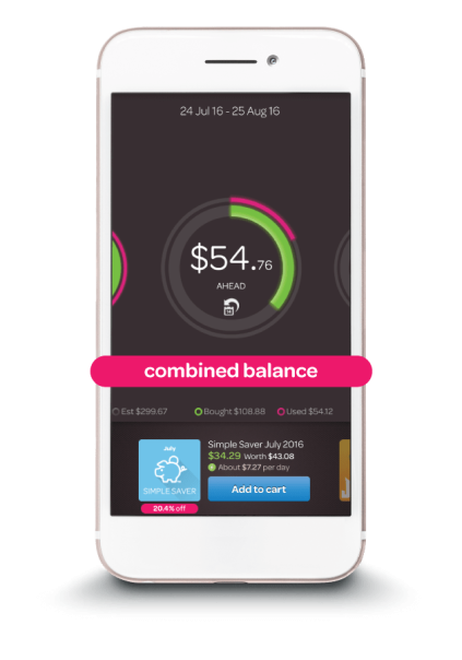
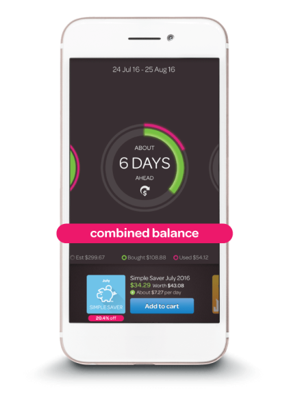
You can swipe back to see each property’s circle side-by-side for previous months. But for current and future months, the circle will show a combined account view.
Insights
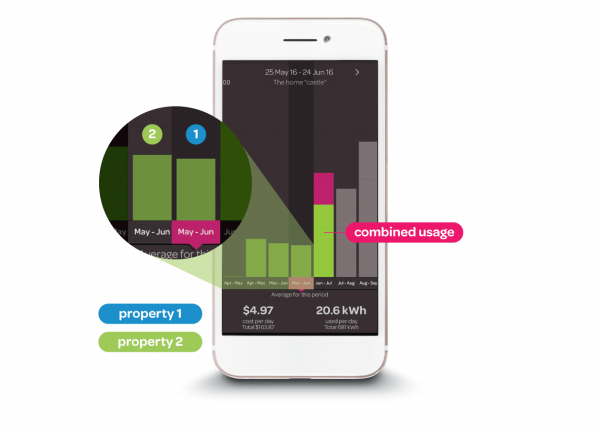
In the Insights graph each property is combined in one bar. Again, you can swipe back to see each property’s graph side-by-side for previous months. The bars in the Insights graph let you see at a glance the estimated monthly dollar cost of your power, based on your Estimated Usage.
Access the Insights graph from the Insight graph heading in the menu, or by tapping the middle icon in the top right of your screen.
Daily usage
So that you don’t drown in data, we keep the detailed Daily Usage graphs separate. Access your daily usage by tapping the icon that is furthest top right of your screen, or from the Daily usage heading in the menu.
Desktop: Power organiser and days ahead
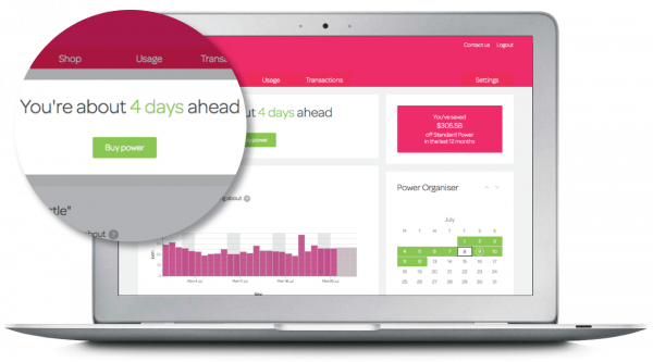
For example at the top of your Balance page, you’ll see how many days ahead or behind you are with your power purchases for all of your properties, based on your Estimated Usage.
Your Power Organiser will also show you where you’re at on all of your properties. So you can see whether or not you’ve bought enough power to cover all your Estimated Usage.
Daily and current usage
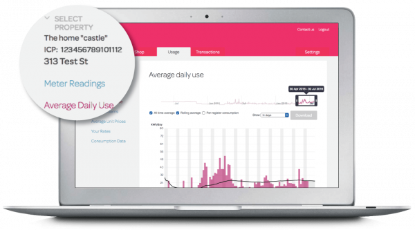
Your daily and current usage in kWh (kilowatt hours) for each property will be shown separately, one below the other.
The more detailed daily usage graphs under the ‘Usage’ tab will also be displayed separately. Use ‘Select Property’ on the left-hand menu on each page to drill down to see separate, detailed usage data for each of your properties.
How do I track my usage if I have more than one property?
How do I track my usage if I have more than one property?
Not in Powershop Lab yet – but watch this space! ⚡
Using the activity tracker in the mobile app
Using the activity tracker in the mobile app
The Activity Tracker lets you add notes to your ‘Daily usage’ graph so you can explain any spikes (or drops) in your power usage. You can use the Activity Tracker to explain past eventsor you can set it to keep track of a future time.
Understanding your past usage
Say you look at your daily usage graph and notice that your usage for one particular Sunday was really high. What was that about?
Oh, that’s right. You were cooking up a storm meal-prepping.
You can easily note this in your Activity Tracker and choose an icon (e.g. cooking = a roasting chicken, laundry = a pair of underpants) to add to the relevant day on your daily usage graph. That way, you can see at a glance why your power usage peaked on that particular day.
Using the info
If you keep noticing big spikes that are down to having the oven on, you may decide to look into getting a more energy efficient oven. Or you may simply know that on the weeks you’re channeling your inner Masterchef, you may want to whip into the Shop and buy an extra Powerpack.
Experiment and keep tabs on future use
You can also play around with changing your behaviour and use your Activity Tracker to monitor the outcome – for example, taking showers instead of baths for a week. Or if you have a meter that can measure peak and off peak usage (e.g. day/night metering) doing your washing or putting the dishwasher on at off peak times.
Specify the start and end times of your experiment in your Activity Tracker and you’ll get readings on the electricity used during these times, and how much it costs based on your average cost per kWh for that period.
Looking at the past or the future, it’s a handy wee device with many uses:
- Seeing the effect a new heating system has on your usage.
- Settling squabbles with flatmates who left the heater on in their bedroom all day.
- Showing your teenagers the impact their long showers have on your back pocket.
![]()
![]()
![]()
![]()
Using the Activity Tracker in the mobile app
Using the Activity Tracker in the mobile app
This feature has retired to a sunny beach somewhere!
Help me understand my usage pattern chart
Help me understand my usage pattern chart
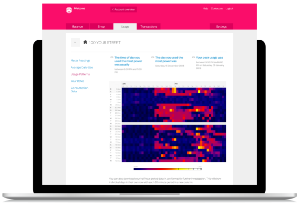
If you have a smart meter the usage patterns chart is a neat tool that can help you understand your usage and become more energy efficient. It may look like a game of Space Invaders at first, but it doesn’t take long to get the hang of using it.

Dark low, bright high
Each coloured square on the heatmap chart is one half hour period of one day. The brighter the square is, the higher the usage. The darker the square is, the lower the usage. Black is the lowest, blue is low, purple is lowish, red is medium, orange is quite high and yellow is higher and white the highest.
Finding patterns
You can look at your usage patterns for the last 4 weeks, 12 weeks or year – which is handy for seeing when you typically use the most power. The narrative above the chart will also help you to do this. For the selected time period, it tells you:
- what time of day you consistently used the most power
- the day you used the most power, and
- the time and day you used the most power over the whole of that time period.
You can click on this narrative to highlight this time period on the heatmap.
Getting smart with your usage
Say your chart is consistently yellow between 7am and 8am, when your shower is heavily used. This suggests you may be using a lot of power to heat water for your shower. Therefore, making your shower or hot water cylinder more energy efficient may be one of the most effective ways to use less power in your home.
Visit the Energywise website to find out how to make your appliances more energy efficient.
Number crunching
If spreadsheets are your thing, you can download data for every half hour period in .csv format (think Excel). This can be handy if you’d like to investigate, say, the effect of using your heatpump at different temperature settings, or for different time periods e.g. “am I better off leaving my heat pump on at a lower temperature while I’m at work, or turning it off completely, then cranking it up when I get home?”.
Switched to Powershop and used a lot of power?
Switched to Powershop and used a lot of power?
This could be because the final meter reading your previous power company gave us for your property was an estimate that was much lower than what you had actually used. So it will look like you’ve used more power than you actually have since switching. If this is the case, email us or contact us via the Live Chat option on our website and we will contact your previous power company to sort it out
I seem to be using more power than usual, what’s going on?
I seem to be using more power than usual, what’s going on?
If you’re getting through more power than usual, first have a think about whether anything in your household has changed. Cold weather can sometimes sneak up on us and we find ourselves using the heater more or having longer hot showers. Or perhaps the rellies stayed a few nights, in which case, it’s more than likely you used more power than you normally would.
For tips on keeping usage as low as you can visit the Energywise website.
If you’re using more power than usual and you’re sure that nothing has changed, it could mean that one of your appliances is faulty. For example, leaking hot water cylinders can churn through electricity. If you suspect something’s not quite right, ask your local electrician to come and assess your home.
Which activities and appliances use the most power?
Which activities and appliances use the most power?
If you have a smart meter you can figure this out from your Usage Patterns in your desktop account, by selecting ‘Usage’ then ‘Usage patterns’.
Your usage patterns chart will help you see when your usage is highest. By knowing this, you can make changes to become more energy efficient.
Let’s say your highest usage is between 5.30pm and 7.30 pm – when you’d normally run the bath and have the heater on.
Over the next few days, you could experiment with alternating between only having a bath and only having the heater on, to see how it affects your usage during that period.
If your usage falls dramatically when you only have a bath, you know that your heater is using a large chunk of your power. You may then decide to look into more energy efficient heaters.
If not having a bath makes the biggest difference, you may decide to swap to showers to trim your usage down.
What can I do to reduce my power usage?
What can I do to reduce my power usage?
The main ways to save power are to invest in energy efficient appliances and look at where you might be able to change your habits.
You’ll find heaps of power saving ideas on our blog post about saving power at home.
Track your usage
How to track your usage
How to track your usage
Use our nifty tools to keep an eye on how much power you’re using, and when you use it most.
Daily usage
If you have a smart meter, your daily usage graph makes it easy to see any changes in your usage. So if your usage spikes or falls dramatically, you can dig a little deeper to try to find out why.
Mobile app: In Powershop’s mobile app – you can access your daily usage graph by tapping the icon at the bottom right of your screen.

Desktop: In your desktop account – go to your ‘Balance’ page and click on ‘Usage’, ‘Average daily use’.

If you have more than one property you’ll see your properties’ daily usage graphs, in a drop-down menu where you can select which property you would like to view.
Read more on how to track usage if you have more than one property.
Current usage
In Powershop’s mobile app – your ‘Daily usage’ graph has a smart feature to show you your average dollar cost per day, and the kWh (kilowatt hours) of power you’ve used each day.

Insights graph
The mobile app also has an Insights graph. The bars in the Insights graph let you see at a glance the monthly dollar cost of your power. Access the Insights graph by tapping the middle icon at the bottom of your screen. This monthly dollar cost for previous Account Review periods shows what you paid for those periods. The monthly dollar cost for your current Account Review period is based on both your actual and Estimated Usage.

Usage pattern
If you have a smart meter, and feel like channeling your inner detective, you can discover what times of day you use the most (and least) power – down to half hourly intervals.
This means you can think about what you normally do at peak times of day and, if possible, make changes to be more energy efficient. You can access this tool from your desktop account. If you don’t have a smart meter you won’t have this tool in your account.

Activity Tracker
Want to get clever about tracking your usage? Then the Activity Tracker on the mobile app is for you.
It’s super simple to use, and we reckon it’ll help you monitor, understand and, ultimately, take control of your usage.
The Activity Tracker allows you to add notes to your ‘Daily usage’ graph, to help you explain any spikes or drops in your power usage. You can also set it to keep track of a future time period.
You can find the Tracker under your Daily Usage graph, by tapping the stopwatch icon in the top left of your screen.
![]()
How do I track my usage if I have more than one property?
How do I track my usage if I have more than one property?
To keep life simple, we’ll combine some of the data for all your properties and keep some of it separate. Whichever makes more sense.
In Powershop’s mobile app
Days and dollars ahead
Inside the circle on the Balance screen we show about how many dollars ahead or behind you are with your power purchases, based on your Estimated Usage. This covers all the properties under your account.
If you tap the dollar figure, this will switch to show you how many days ahead or behind you are, based on your Estimated Usage.


You can swipe back to see each property’s circle side-by-side for previous months. But for current and future months, the circle will show a combined account view.

Insights
In the Insights graph each property is combined in one bar. Again, you can swipe back to see each property’s graph side-by-side for previous months. The bars in the Insights graph let you see at a glance the estimated monthly dollar cost of your power, based on your Estimated Usage.
Access the Insights graph from the Insight graph heading in the menu, or by tapping the middle icon in the top right of your screen.

Daily usage
So that you don’t drown in data, we keep the detailed Daily Usage graphs separate.
Access your daily usage by tapping the icon that is furthest top right of your screen, or from the Daily usage heading in the menu.
In your desktop account
Power organiser and days ahead
For example at the top of your Balance page, you’ll see how many days ahead or behind you are with your power purchases for all of your properties, based on your Estimated Usage.
Your Power Organiser will also show you where you’re at on all of your properties. So you can see whether or not you’ve bought enough power to cover all your Estimated Usage.

Daily and current usage
Your daily and current usage in kWh (kilowatt hours) for each property will be shown separately, one below the other.
The more detailed daily usage graphs under the ‘Usage’ tab will also be displayed separately. Use ‘Select Property’ on the left-hand menu on each page to drill down to see separate, detailed usage data for each of your properties.

Using the Activity Tracker in the mobile app
Using the Activity Tracker in the mobile app
The Activity Tracker lets you add notes to your ‘Daily usage’ graph so you can explain any spikes (or drops) in your power usage. You can use the Activity Tracker to explain past eventsor you can set it to keep track of a future time.
Understanding your past usage
Say you look at your daily usage graph and notice that your usage for one particular Sunday was really high. What was that about?
Oh, that’s right. You were cooking up a storm meal-prepping.
You can easily note this in your Activity Tracker and choose an icon (e.g. cooking = a roasting chicken, laundry = a pair of underpants) to add to the relevant day on your daily usage graph. That way, you can see at a glance why your power usage peaked on that particular day.
Using the info
If you keep noticing big spikes that are down to having the oven on, you may decide to look into getting a more energy efficient oven. Or you may simply know that on the weeks you’re channeling your inner Masterchef, you may want to whip into the Shop and buy an extra Powerpack.
Experiment and keep tabs on future use
You can also play around with changing your behaviour and use your Activity Tracker to monitor the outcome – for example, taking showers instead of baths for a week. Or if you have a meter that can measure peak and off peak usage (e.g. day/night metering) doing your washing or putting the dishwasher on at off peak times.
Specify the start and end times of your experiment in your Activity Tracker and you’ll get readings on the electricity used during these times, and how much it costs based on your average cost per kWh for that period.
Looking at the past or the future, it’s a handy wee device with many uses:
- Seeing the effect a new heating system has on your usage.
- Settling squabbles with flatmates who left the heater on in their bedroom all day.
- Showing your teenagers the impact their long showers have on your back pocket.
![]()
![]()
![]()
![]()
Help me understand my usage pattern chart
Help me understand my usage pattern chart
If you have a smart meter the usage patterns chart is a neat tool that can help you understand your usage and become more energy efficient. It may look like a game of Space Invaders at first, but it doesn’t take long to get the hang of using it.

Dark low, bright high
Each coloured square on the heatmap chart is one half hour period of one day. The brighter the square is, the higher the usage. The darker the square is, the lower the usage. Black is the lowest, blue is low, purple is lowish, red is medium, orange is quite high and yellow is higher and white the highest.
Finding patterns
You can look at your usage patterns for the last 4 weeks, 12 weeks or year – which is handy for seeing when you typically use the most power. The narrative above the chart will also help you to do this. For the selected time period, it tells you:
- what time of day you consistently used the most power
- the day you used the most power, and
- the time and day you used the most power over the whole of that time period.
You can click on this narrative to highlight this time period on the heatmap.
Getting smart with your usage
Say your chart is consistently yellow between 7am and 8am, when your shower is heavily used. This suggests you may be using a lot of power to heat water for your shower. Therefore, making your shower or hot water cylinder more energy efficient may be one of the most effective ways to use less power in your home.
Visit the Energywise website to find out how to make your appliances more energy efficient.
Number crunching
If spreadsheets are your thing, you can download data for every half hour period in .csv format (think Excel). This can be handy if you’d like to investigate, say, the effect of using your heatpump at different temperature settings, or for different time periods e.g. “am I better off leaving my heat pump on at a lower temperature while I’m at work, or turning it off completely, then cranking it up when I get home?”.
High Usage / Reducing Usage - FAQs
Switched to Powershop and used a lot of power?
Switched to Powershop and used a lot of power?
This could be because the final meter reading your previous power company gave us for your property was an estimate that was much lower than what you had actually used. So it will look like you’ve used more power than you actually have since switching. If this is the case, email us or contact us via the Live Chat option on our website and we will contact your previous power company to sort it out
I seem to be using more power than usual, what’s going on?
I seem to be using more power than usual, what’s going on?
If you’re getting through more power than usual, first have a think about whether anything in your household has changed. Cold weather can sometimes sneak up on us and we find ourselves using the heater more or having longer hot showers. Or perhaps the rellies stayed a few nights, in which case, it’s more than likely you used more power than you normally would.
For tips on keeping usage as low as you can visit the Energywise website.
If you’re using more power than usual and you’re sure that nothing has changed, it could mean that one of your appliances is faulty. For example, leaking hot water cylinders can churn through electricity. If you suspect something’s not quite right, ask your local electrician to come and assess your home.
Which activities and appliances use the most power?
Which activities and appliances use the most power?
If you have a smart meter you can figure this out from your Usage Patterns in your desktop account, by selecting ‘Usage’ then ‘Usage patterns’.
Your usage patterns chart will help you see when your usage is highest. By knowing this, you can make changes to become more energy efficient.
Let’s say your highest usage is between 5.30pm and 7.30 pm – when you’d normally run the bath and have the heater on.
Over the next few days, you could experiment with alternating between only having a bath and only having the heater on, to see how it affects your usage during that period.
If your usage falls dramatically when you only have a bath, you know that your heater is using a large chunk of your power. You may then decide to look into more energy efficient heaters.
If not having a bath makes the biggest difference, you may decide to swap to showers to trim your usage down.
What can I do to reduce my power usage?
What can I do to reduce my power usage?
The main ways to save power are to invest in energy efficient appliances and look at where you might be able to change your habits.
You’ll find heaps of power saving ideas on our blog post about saving power at home.